Where We Are - And Where We Need To Go

A Graphical Perspective

For those of you into graphs, Biobot has a new Year-Over-Year option, with 2024 being in orange. You can see that the orange curve is pretty flat over the last few weeks, and is closely following last year’s curve (lime green). If we continue on this path, we’ll be at low levels of the virus for a few months. Enjoy!

A Mathematical Perspective

Last time, we shared calculations that about one of every 100 people is currently contagious with covid-19. In the Northeast, this hasn’t changed much. In the rest of the country, it’s dropped lower — now more like one of every 200 people. 

Let’s use the Northeast for an example, and expand the math. If you are having a haircut with one barber and you two are the only ones there, clearly there is a 1% chance that the barber is currently contagious. If you are having a bridge party with two tables, the odds are 8% that one or more of the eight of you are contagious. With 100 people in your grocery store, there is a 63% chance at least one person is contagious. And with 450 people or more, the odds are at least 99%.

Given this information, you can adjust your covid safety practices to suit.

A Ventilation Perspective

As you know, great fresh air ventilation can cut your risk of covid-19 and other airborne diseases by 80% or more! Yet, this convenient remedy (no vaccinations or masks required!) is almost universally ignored. If you had a choice of stores for your shopping, would you favor one with a big sign on the door that said

Welcome — Come In To
Certified and Monitored
HEALTHY FRESH AIR

and had a nice picture on the door, and a big bold meter inside showing off the “green zone” fresh air?

There are some important voices joining in this message. Here is a sampling:

- Some truth from the World Health Organization: They assembled fifty experts and produced a document recognizing the obvious — that most respiratory infections, including Covid-19, influenza and measles, are spread by aerosols that stay suspended in the air for hours, and NOT by large droplets that magically fall to the ground and don’t infect persons more that three feet away. For readers of this blog, this is not news (see Mar. 21st, 2022 blog post). “The change puts fresh emphasis on the need to improve ventilation indoors.” Now the question is whether the CDC and the rest of America will follow suit.

https://www.nbcnews.com/health/health-news/who-airborne-disease-cdc-updated-guidelines-rcna149843

- Canada is taking good air quality seriously. Here is an excellent article directed toward schools. It includes quotes from numerous experts. Epidemiologist Colin Furness said

“It won’t be cheap to improve ventilation in thousands of classrooms. But even if you don’t think protecting kids is important, you should still get behind this from a dollars and cents perspective. Consider the difference in cost between disease prevention and disease treatment. When some kids get COVID or the flu at school and come home, grandpa and grandma end up in the intensive care unit. A couple of stays in the ICU might pay for all the ventilation upgrades needed for a school.”

And he is on board with letting people know about the air quality.

“Dangerous air isn’t noticeable. Politicians, like everyone else, need to be able to see a problem to be motivated to do something about it. To help us get there, I would like to see mandated air quality sensors in public rooms and spaces. That way people could see when they board a train or bus, or go into an office or a classroom, what the air quality is actually like. If we want to have a serious conversation about air quality, we need to bring people to a certain level of literacy and awareness. To solve invisible problems, you really gotta make them visible first.”

https://healthydebate.ca/2023/11/topic/structures-are-sick-clean-air-schools/

- In the US, on CBS, 60 Minutes had a segment on ventilation in October of last year. They interviewed people who had suffered from poor ventilation, as well as several experts, including Harvard’s Joe Allen, who said

“Think about the public health gains we've made over the past hundred years. We've made improvements to water quality, outdoor air pollution, our food safety, we've made improvements to sanitation: absolute basics of public health. Where has indoor air been in that conversation? It's totally forgotten about. And the pandemic showed what a glaring mistake that was.”

https://www.cbsnews.com/news/indoor-air-quality-healthy-buildings-60-minutes-transcript/ 


Now You Can Search This Blog!
We have added a “search” bar for this blog - scroll all the way down
to the very bottom of a blog page to find the search bar.

When using the “search” bar, please, if at first you don’t succeed, try, try again!
[The website company has an ongoing glitch.]

Find all of the blog post titles on our “Resources” page on the website:
Comprehensive List of Blog Postings (PDF).


We invite you to subscribe to our Newsletter -
the cost is free and each new post comes to your email
every two weeks on Thursdays!

To subscribe, simply email safetulator@kohlerandlewis.com
with your name and email address and we will sign you up.


Entering the Summer Slowdown (It’s A Good Thing!)

The Summer Slowdown

If this year is like last year, we have now begun a few months with low levels of the covid-19 virus circulating in our communities. The data come from sampling sewage, and I’ve translated that into how many people are contagious with covid-19 out of every 100 people. I’ll show you the math below.

If 1 of every 100 people (or fewer) is currently contagious with covid-19, I’m going to call that a “low” level in the community. For the Northeast region (one of Biobot’s four regions), we got into the low range on March 30th. The rest of the country is even lower. 

Last year, as a national average, we were at this low level from March 11th to August 5th, as shown below in the graphs from Biobot. 

Biobot Graph of March 11th and August 5th

After that, the levels went back up as people closed up buildings to run air conditioning, and then went back to school. I expect the same thing will happen this year.

And for now, it’s encouraging that we have low levels and can gather safely in the ways in which I’ve described in earlier blogs.

Here Is the Math Summary

Several covid-19 modelers made translations from sewage sampling to case rates. I’m using the work of modeler JP Weiland, who had national new cases about 1,100 times the average copies/mL. I calculated this from the three points shown with arrows in the chart below, and correlated them with the Biobot data.

9/22/23, Biobot—640 copies, Weiland—718,367 new infections. (x 1122)
6/17/23, Biobot—168 copies, Weiland—185,204 new infections. (x 1102)
12/13/22, Biobot—1,160 copies, Weiland—1,302,041 new infections. (x 1122)

These are new infections, and we need to multiply these by the average number of days a person is contagious. There’s no easy answer, but I’m using 7 days, based in part on the chart below. 

Abbott BinaxNOW Covid-19 symptom graph

Now we can find the sewage sampling rate that leads to the figure of 1 in 100 people being contagious. It turns out to be 432 copies.

432 x 1100 = about 475,000 new infections 

divided by 333 million people in the U.S. =

about 1 in every 700 people infected today and

divided by 7 days = 1 in 100 contagious today.

Note that individual sampling sites will vary and cannot be directly compared. That is, the absolute numbers may be different, so the 1100 factor will not apply, but overall shapes of the curves will probably be similar, with perhaps even lower points to come in the next few months by a factor of two three.


Now You Can Search This Blog!
We have added a “search” bar for this blog - scroll all the way down
to the very bottom of a blog page to find the search bar.

When using the “search” bar, please, if at first you don’t succeed, try, try again!
[The website company has an ongoing glitch.]

Find all of the blog post titles on our “Resources” page on the website:
Comprehensive List of Blog Postings (PDF).


We invite you to subscribe to our Newsletter -
the cost is free and each new post comes to your email
every two weeks on Thursdays!

To subscribe, simply email safetulator@kohlerandlewis.com
with your name and email address and we will sign you up.


How To Find the Good Air

Readers of this blog know how important it is to spend your indoor time in places with good fresh air ventilation, which equals less virus and air contaminants of all kinds. At your indoor workplace and at your home, you have some control of the amount of fresh air, but what about all the other places you go? You can choose to frequent places with good fresh air! Here are some tips:

Fresh Air Meters

Of course, the most accurate way to tell is with a Safetulator Fresh Air Meter (see Apr. 29, 2022 blog post). These devices measure carbon dioxide (CO2) in the air. This odorless gas exists in the atmosphere in a concentration of about 0.04%, but it is in our exhaled breath at levels 100 times higher! The CO2 levels in a room come to a balance point between the high CO2 levels exhaled from people and the very low CO2 level coming in with the fresh air ventilation. The balance point - the measured concentration - can tell us the amount of fresh air per person. This is exactly what we want to know, since the more fresh air coming in (and exhaust air going out), the more this air dilutes the amount of viruses and other contaminants in the air. The Safetulator meters give simple color-coded results, and if it’s “in the green” then the air is meeting the fresh air safety standards.

The Nose Knows

If you don’t have a meter, most people can detect high air contaminant levels just by the smell. Poorly-ventilated spaces include a hardware store with a smell of pesticides, and an airplane cabin with an artificial chemical smell. Strong good smells also indicate poor ventilation, as in a restaurant with strong cooking smells, and a leather store with a strong and wonderful smell of leather.

Photo of leather store

Restaurants

Restaurants can have very good or very bad fresh air, or anywhere in between. Here is how restaurant ventilation works: Every restaurant that cooks food has a large exhaust hood over the cooking equipment. The fans in this hood system exhaust a large amount of air from the kitchen, as required by the building codes. If air goes out, air must come in, and this outdoor make-up air sometimes comes in directly to the kitchen. If this is the case, it tells us nothing about the amount of fresh air in the dining area full of people. In other restaurants, most or all of the make-up air comes directly into the dining area, and then some of the dining room air goes into the kitchen to make up for the exhaust air. In this case, the dining area can have excellent fresh air. The bigger the hood, and the smaller the dining area, the better will be the fresh air.

The Chipotle chain of restaurants is an example of the second, good fresh air design. They typically have these funky big round “nozzles” blowing fresh air into the dining area, and the CO2 levels are in the green.

Photo of Chipotle restaurant

Urgent Care Centers

Given any type of building, some will be good, some not so good for fresh air. Urgent care centers are examples. You might think that any health care operation would have good air, but that is not the case! One of our local urgent care centers has a crowded waiting room with CO2 levels that I have never measured in the green. Another one, Convenient MD, has a discrete CO2 sensor on the waiting room wall which probably means they are continuously regulating the amount of fresh air to give more fresh air when there are more people waiting, and vice versa. I have been there a couple of times, and the CO2 was in the green or right on the edge. In addition, they have an air purifier in each room, so the overall air quality that I have measured has always been well into the green. Now that’s more like it!

Photo of air purifier

Now You Can Search This Blog!
We have added a “search” bar for this blog - scroll all the way down
to the very bottom of a blog page to find the search bar.

When using the “search” bar, please, if at first you don’t succeed, try, try again!
[The website company has an ongoing glitch.]

Find all of the blog post titles on our “Resources” page on the website:
Comprehensive List of Blog Postings (PDF).


We invite you to subscribe to our Newsletter -
the cost is free and each new post comes to your email
every two weeks on Thursdays!

To subscribe, simply email safetulator@kohlerandlewis.com
with your name and email address and we will sign you up.


Getting Close to the Edge of the Woods

March 11th marked four years since the World Health Organization declared the “novel coronavirus” to be a world-wide pandemic. We’ll have future stories on this history and the lessons learned, or not learned, from the past four years, but for now, here is a current status report.

People walking in the woods

It’s been four years, and yet, still more than a thousand people a week in the U.S. are dying of the disease (2% of all deaths), (https://covid.cdc.gov/covid-data-tracker/#datatracker-home). The vast majority of these deaths are from the 65 million people who are either 65 and older, or those whose immune system is compromised. And among those surviving their experiences with covid-19 and vaccinations, there are at least 17 million Americans who suffer from “Long Covid”. https://www.theguardian.com/world/2024/mar/15/long-covid-symptoms-cdc

There now is a predictable pattern of increased disease during the typical winter, when people spend more time indoors (and we STILL don’t have enough improved fresh air ventilation to make a noticeable dent in the spread of airborne pathogens). People who choose to reduce their risk of another covid-19 infection continue to have good tools available (see Jan. 25, 2024 blog post).

And on the positive side, we can look forward to reduced levels of the virus in circulation, and reduced protective measures needed, starting as soon as the next few weeks.

We still have ongoing good sampling of wastewater for monitoring the levels of covid-19 and other viruses.  In New Hampshire, the graphs for Keene (brown) and Manchester (blue) show that we were at a low level last spring and summer from April through July (below the red line). So maybe only a few more weeks till we get similar conditions in both the locations shown!

And on the national level, the graphs for the Northeast (gold), Midwest (purple), South (red), and West (green) show a similar pattern of medium levels currently, and will probably continue to head downward. 

In the meantime, at whatever the levels are, keep the fresh air flowing for reduced airborne illnesses of all kinds!


Now You Can Search This Blog!
We have added a “search” bar for this blog - scroll all the way down
to the very bottom of a blog page to find the search bar.

When using the “search” bar, please, if at first you don’t succeed, try, try again!
[The website company has an ongoing glitch.]

Find all of the blog post titles on our “Resources” page on the website:
Comprehensive List of Blog Postings (PDF).


We invite you to subscribe to our Newsletter -
the cost is free and each new post comes to your email
every two weeks on Thursdays!

To subscribe, simply email safetulator@kohlerandlewis.com
with your name and email address and we will sign you up.


A Covid-Free Solar Eclipse

Covid-19 Risk When You Are Outside

The covid topic is just an intro for the real news—the upcoming total solar eclipse on Monday, April 8th.

Since people will be gathering outside in fairly small groups, the risk of spreading covid-19 and other airborne diseases is infinitesimal. Something like one in a million. (Email me for the calculation if you’re interested.) Still, exercise your usual level of care if you are inside buildings before or afterwards, otherwise, just enjoy the eclipse!

The Path of the Eclipse

More than 30 million people live in the eclipse’s path from Texas to Maine, and another four million are expected to travel to be able to see it. I traveled and saw the 2017 eclipse, a memory I will always cherish.

There is an hour-plus of build-up, during which the moon takes an ever-larger bite out of the sun’s disk, then up to four minutes where the entire sun is blocked—that time goes by fast!—and then an hour-plus on the tail end.

Below is a link to the eclipse map—on their website, you can click on a location to get the details, and scroll down further for more in-depth info. The map shows the path of totality between the blue and red lines, with the center (best) locations along the green line.

https://nso.edu/for-public/eclipse-map-2024/

Map with path of the eclipse

The closer you are to the center of the path, the longer is the total eclipse, and the more pure is the image. When you are closer to the edge of the path, a little light leaks around the edge on one side.

Experiencing the Eclipse

Don’t ignore early and late stages. Stand under some trees where the light is glimmering through the leaves and making bright spots on the sidewalk below. Then observe the shape of these bright spots! (Hint—you, and the tree, have created a “camera obscura” with dozens of projected images of the sun on the sidewalk.)

It is only during the few minutes of totality when the earth darkens—but not black like midnight, only like a strange dusk or dawn. The sun’s corona streams out around the edges, and the temperature on earth drops noticeably. Be especially aware of the sounds of nature around you, just before, during, and after totality—you may hear unusual sounds and silences of the birds and insects.

But Will It Be Sunny?

Maybe. For most locations, the chances are it won’t be totally sunny. It’s a roll of the dice.

Here are the historical climate odds for many locations:

https://ncsu.maps.arcgis.com

For example, there are 3:1 odds of being sunny in San Antonio, Texas, but only about 50-50 in Montpelier, Vermont—here is the graph for Montpelier:

Climatological Cloud Conditions graph

Eye Protection

I hope you already know enough to never look at the sun with your bare eyes—or sunglasses, or between your fingers, or through your shirtsleeve, etc.! The few minutes of totality are the ONLY time when it’s safe to look with your bare eyes. Otherwise, special eclipse-darkening film is readily available if you order it now. Binoculars are also useful (with removable darkening film).

Here is a low-cost option—small two-power binoculars with darkening film, $7 from telescope-maker Celestron:

https://www.amazon.com

Solar Safe glasses for eclipse

Is It Worth It?

Yes! This is a chance of a lifetime—well, one of two or three chances of a lifetime, depending on how far you want to travel. The next one, that travels from California to Florida, is two decades away, in 2045!


Now You Can Search This Blog!
We have added a “search” bar for this blog - scroll all the way down
to the very bottom of a blog page to find the search bar.

When using the “search” bar, please, if at first you don’t succeed, try, try again!
[The website company has an ongoing glitch.]

Find all of the blog post titles on our “Resources” page on the website:
Comprehensive List of Blog Postings (PDF).


We invite you to subscribe to our Newsletter -
the cost is free and each new post comes to your email
every two weeks on Thursdays!

To subscribe, simply email safetulator@kohlerandlewis.com
with your name and email address and we will sign you up.


Whoops - A Double Hump?

Last time, we looked at the national virus sampling trends, and saw we were on the way down from the winter peak. 

Well, levels are on the rise again in some areas. Still usually at a medium level, but we are not at all in a state of "the coast is clear"!

Here are some graphs, all adjusted to show the most recent six months.

Nationally, levels are rising in the Northeast (orange).

Biobot six months Feb 2024

Vermont and New Hampshire have a mixed bag depending on location. In Vermont, levels in Montpelier (orange) are heading back up.

VT six months Feb 2024

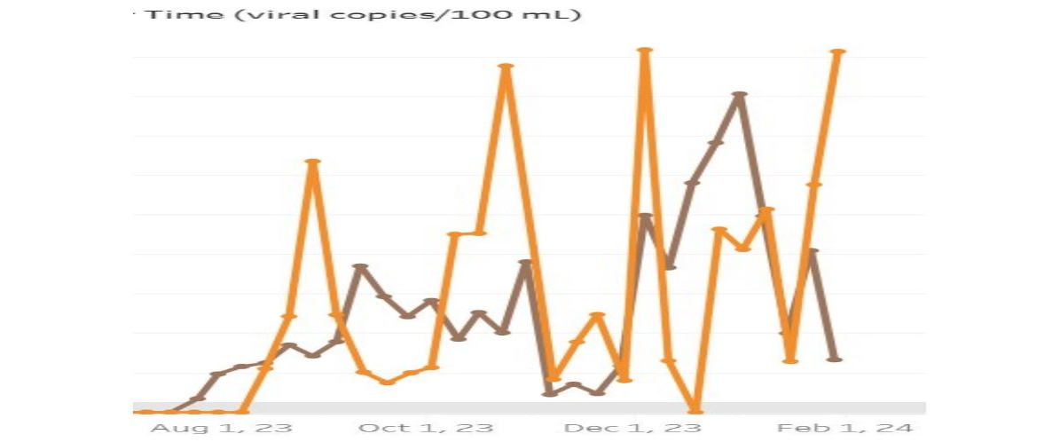
And in New Hampshire, for example, Berlin (orange) is back up at this winter's peak, while Keene (brown) is down almost at a summer level.

NH six months Feb 2024

We didn't pick the colors on these graphs, but it looks like to keep your levels low, don't be orange!


Now You Can Search This Blog!
We have added a “search” bar for this blog - scroll all the way down
to the very bottom of a blog page to find the search bar.

When using the “search” bar, please, if at first you don’t succeed, try, try again!
[The website company has an ongoing glitch.]

Find all of the blog post titles on our “Resources” page on the website:
Comprehensive List of Blog Postings (PDF).


We invite you to subscribe to our Newsletter -
the cost is free and each new post comes to your email
every two weeks on Thursdays!

To subscribe, simply email safetulator@kohlerandlewis.com
with your name and email address and we will sign you up.